• Home
  • Artworks
  • Art Direction/Design
  • Blog
  • About
Menu

Karen Lee Art

  • Home
  • Artworks
  • Art Direction/Design
  • Blog
  • About

Unfold - Parallel Wanderings

I was commissioned by Willoughby Council for the Chatswood Concourse Art Space, 2022.

Part of the Lunar New Year art exhibition theme of reinterpreting Chinese landscape traditions, I explored The Fan in Chinese art, traditionally used as a medium to present stories, abstract landscapes, calligraphy and poetry.

For this exhibition, I interpreted the fan using it’s spatial form with colour , motion and geometry. The fan is reduced to a minimal 2-D form but it’s interior is in motion, changing and, recurring in movement that is imprinted in one’s memory.

A video and installation (a set of 3 digitally printed acrylic panels) were installed in the gallery and also outside on the Urban Screen at The Chatswood Concourse.

https://www.willoughby.nsw.gov.au/Events/Parallel-Wanderings

Watch on Vimeo

PHOTO-2022-06-16-10-55-25.jpg
AD467EAA-40BE-4EC8-B070-FE7F68C39C0F.JPG
Screen Shot 2022-01-25 at 7.10.04 pm.png
Screenshot+2023-03-08+at+11.49.54+am.jpg
Screenshot%2B2023-03-08%2Bat%2B11.49.36%2Bam.jpg
Screen Shot 2022-01-25 at 6.51.05 pm.png
Screen Shot 2022-01-27 at 10.07.31 am.png
screen_at chatswood copy2.jpg
Screenshot%2B2023-03-08%2Bat%2B11.49.26%2Bam.jpg
Screenshot%2B2023-03-08%2Bat%2B11.49.13%2Bam.jpg
Screenshot%2B2023-03-08%2Bat%2B11.49.03%2Bam.jpg
Screenshot+2023-03-08+at+11.48.53+am.jpg
Screenshot+2023-03-08+at+11.48.37+am.jpg
Screenshot 2023-03-08 at 11.48.29 am.png
Screenshot%2B2023-03-08%2Bat%2B11.47.59%2Bam.jpg
Screen+Shot+2022-01-28+at+1.37.56+pm.jpg

Leaves - No Vacancy Gallery

In this series of digital prints, Karen explores colour and abstraction with the repetition of everyday leaves.

Digital Prints on Canson Art Paper

310 gsm Ultra Chrome Ink.  

59.4 x 96 cm.

Edition of 3

Exhibited at No Vacancy Gallery, Melbourne 2018 and 220 Creative Space Gallery, Sydney, 2017

————————————————————————————-

leaves blue green_print.jpg
leaves orange yellow_print.jpg
leaves blue green_print copy.jpg
leaves yellow_print.jpg

Peranakan - Inner Edge Drifting

I was commissioned by the Willoughby City Council, for the 2023 Lunar New Year Festival Art Exhibition. The title of the show, Inner Edge Drifting is curated by Rachael Kiang and Cassandra Hard-Lawrie. The work consists of 28 pieces of laser-cut poplar wood and acrylic paint, installed over 3 walls.

Inner Edge Drifting explores the cultural space experienced by people living in Western cultures (and specifically Australia) who have Asian roots. This third cultural space (often referred to within the experiences of Third Culture Kid) can be experienced by people whose upbringing is culturally different from their parents or where their upbringing has traversed across different geographic locations.

This work explores the concept of the third cultural space through the generations of my mother and grandmother. The motifs and forms represented in the installation represent meaningful objects, heirlooms, and photographs that I have used to consider their lives as Peranakans, a multi-racial mix of Chinese and Malay descent. Both my mother and grandmother traveled and assimilated to new surroundings, but still managed to maintain traces of their original heritage.

In this work, viewers are challenged to fill in the missing pieces. Left open to interpretation, these fragments may potentially offer the missing parts which convey the ambiguity and fluidity of mixing cultures over time, and the desire to fit in. Culture, customs, and memories are overlayed with the present and what is real.

This work was also selected as a finalist in the Ravenswood Women’s Art Prize 2023.

new_flower.png
new_grandma.png
wall 1.jpg
wall 2.jpg
karen and Mayor2a.jpg
outer wall 2aaa.jpg
wall_sign_a.jpg
closeup_corner planta.jpg
IMG_3298.jpg
closeup mum2a.jpg
closeup buttons2a.jpg

Epiphyllum

A series of digital prints based on ‘Peranakan”, which explores the concept of the third cultural space through the generations of my mother and grandmother. An installation work shown at The Chatswood Concourse ArtSpace, February 2023.

60 x 60 cm Digital Prints on Canson Art Paper 310 gsm, Ultra Chrome Ink

1 mum.jpg
Grandma_young3 leaves  copy.jpg
1a grandma.jpg
3 buddhas.jpg
flower2.jpg
flower1.jpg
flower3.jpg
mum 3-05-05.jpg
grandma1a-01.jpg
3 buddhas filled with flowers3-07.jpg

Future Flowers

A self -directed motion design project, ‘Future Flowers’.

This series explores the geometry and unique flaws which are part of nature, expanded within a digital space. Concept, design, style frame design in Photoshop, vector illustration in Illustrator, animation in After Effects.

5 x 1.20min videos, mp4, 1080 x 1920 pixels

April 2023

Future Flowers 1 copy.jpg
Future Flowers pin.jpg
Future Flowers blue.jpg
Future Flowers green.jpg
Future Flowers pink.jpg
Future Flowers orange.jpg

Colour Chords

A personal project exploring the relativity of colour through a series of ongoing motion experiments.

circle_imagery inside copy.jpg
colour chords orange.jpg
colour chords pink2.jpg

Qualia - UNSW Art and Design

‘Qualia’ is an exploration of colour, time and abstraction. Similar to how composers use musical progression, I developed a central theme which I explored, combined and progressively refined into a singular experience.

In my work, I explore ‘Colour Resonance’, the qualia (i.e. subjective sensory and emotional experience) of complimentary and dissonant colour ‘chords’ expressed using abstraction, geometry, motion and time. I use graphic, moving and tactile elements to blur the boundaries between the physical and digital. My work extends the experience of colour beyond light and hue with a conscious intent to actively engage and challenge my audience’s other senses.

Multi-channel video, 2 x 50'“ monitors, 1.24 mins duration

View on Vimeo

Shown at UNSW A&D Annual 19

4 - 14 Dec 2019, Kudos Gallery, Paddington, Sydney

———————

Limited Edition Prints available,

50 cm x 50 cm on 310 gsm Ultra Chrome Ink

pics1.jpg
pics3.jpg
pics2.jpg
03.jpg
02.jpg
03b.jpg
A&D-Annual-instagram V2-20191203-3476.jpg

Dialogues - Cities Foretold

To explore the City of Chatswood, I have reassembled fragments of the city’s buildings and spaces, creating new dialogues between shapes and forms, aiming to simultaneously explore a city in the present and future.

Dialogues 1-10 is also an aspirational idea, represented symbolically with the dual motifs of weightlessness and light to convey a world that is less footprint-heavy on this planet.

Dialogues is a video and outdoor work at the Chatswood Concourse. Part of the ‘Cities Foretold’ show, the theme; ‘Artists reimagine our urban landscape’ from September to October 2022.

Ten acrylic sculptures, made of low-relief perspex, were positioned on the glass balustrades around a reflection pool on the Chatswood Concourse. Made of layered acrylic pieces, laser cut, glued, and assembled by Ian Tran, @domusvim. The low-relief sculptures were accompanied by a two-minute video work, mirroring the sculptural shapes in motion.

With thanks to the curator, Cassandra Hard-Lawrie for the commission.

view the VIDEO here

  View the Video

View the Video

IMG_0490.jpeg
IMG_0404.jpeg
IMG_0481.jpeg
IMG_0563.jpg
IMG_0479.jpeg
9AA5DDDE-0B62-445C-86B1-332A067AA54F.jpeg
IMG_0509.jpeg
IMG_0556.jpeg
IMG_0476.jpeg
IMG_0570.jpeg
IMG_0412.jpeg
IMG_0407.jpeg
IMG_0408 (1).jpeg
2B5DE535-E2A1-43BE-803B-7E8C93E6BB52.jpeg
IMG_0487.jpeg
IMG_0465.jpeg
IMG_0438.jpeg
IMG_0435.jpeg
IMG_0430.jpeg
IMG_5788.jpeg
IMG_0249.jpg

Respond - Barometer Gallery

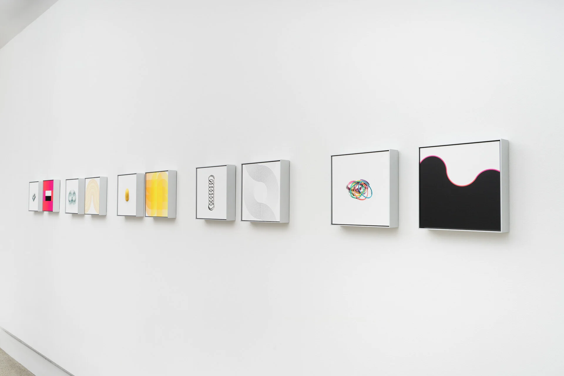
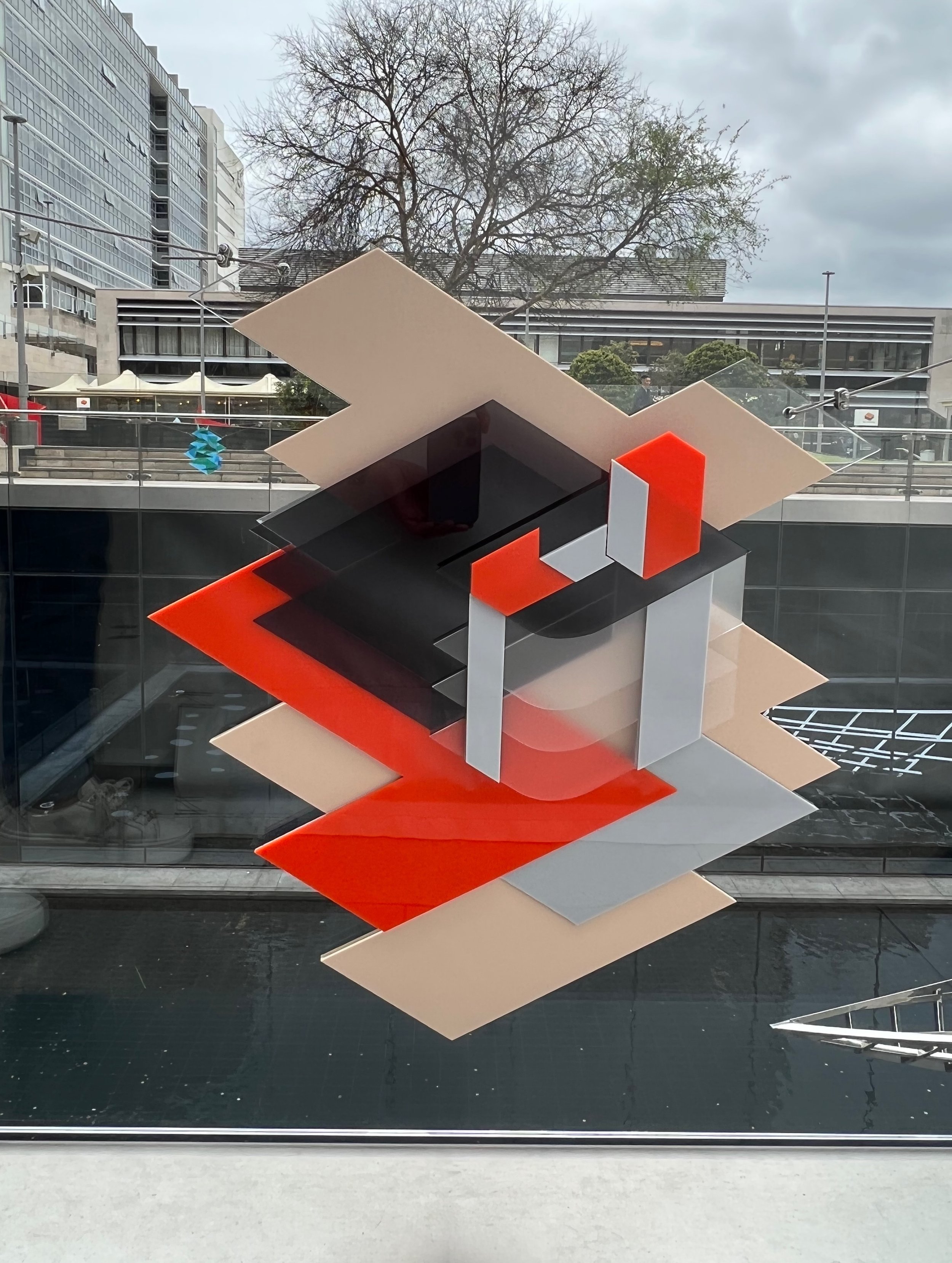
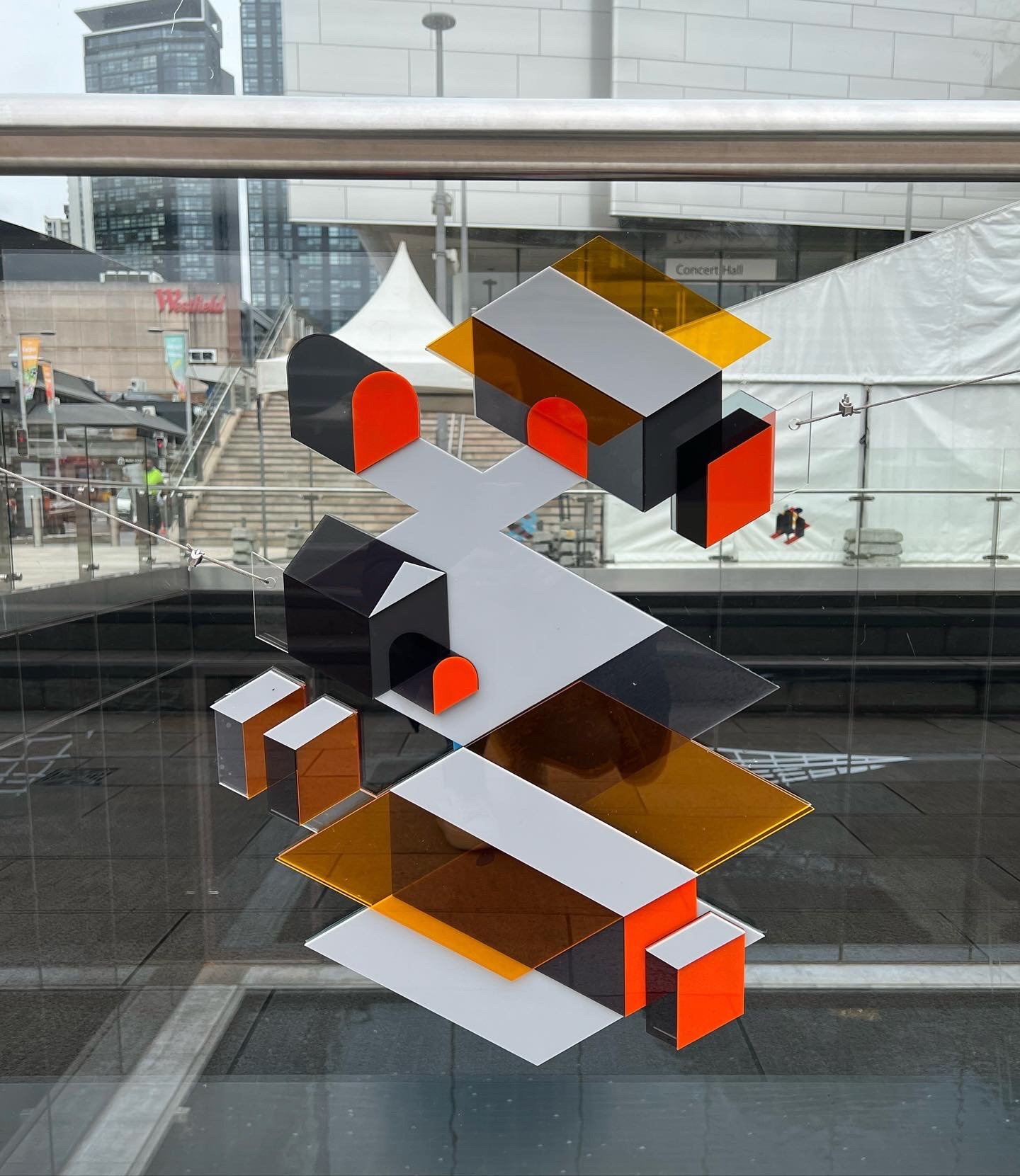
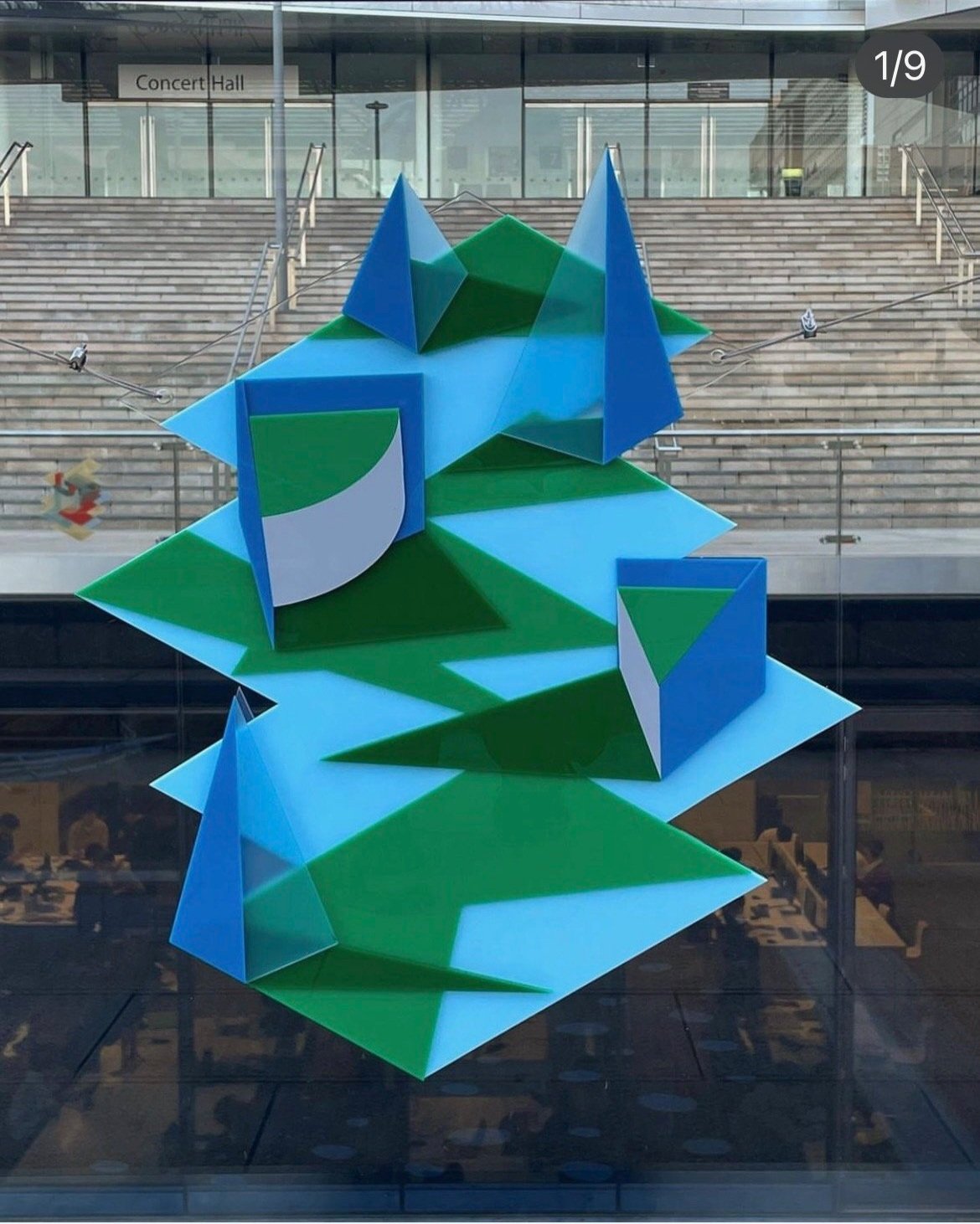
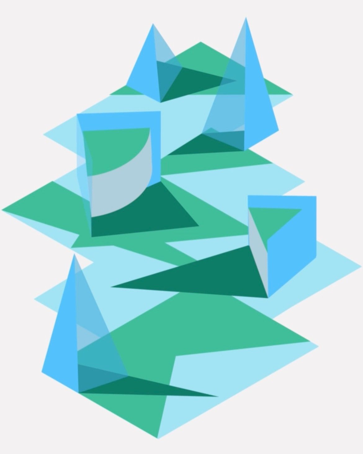
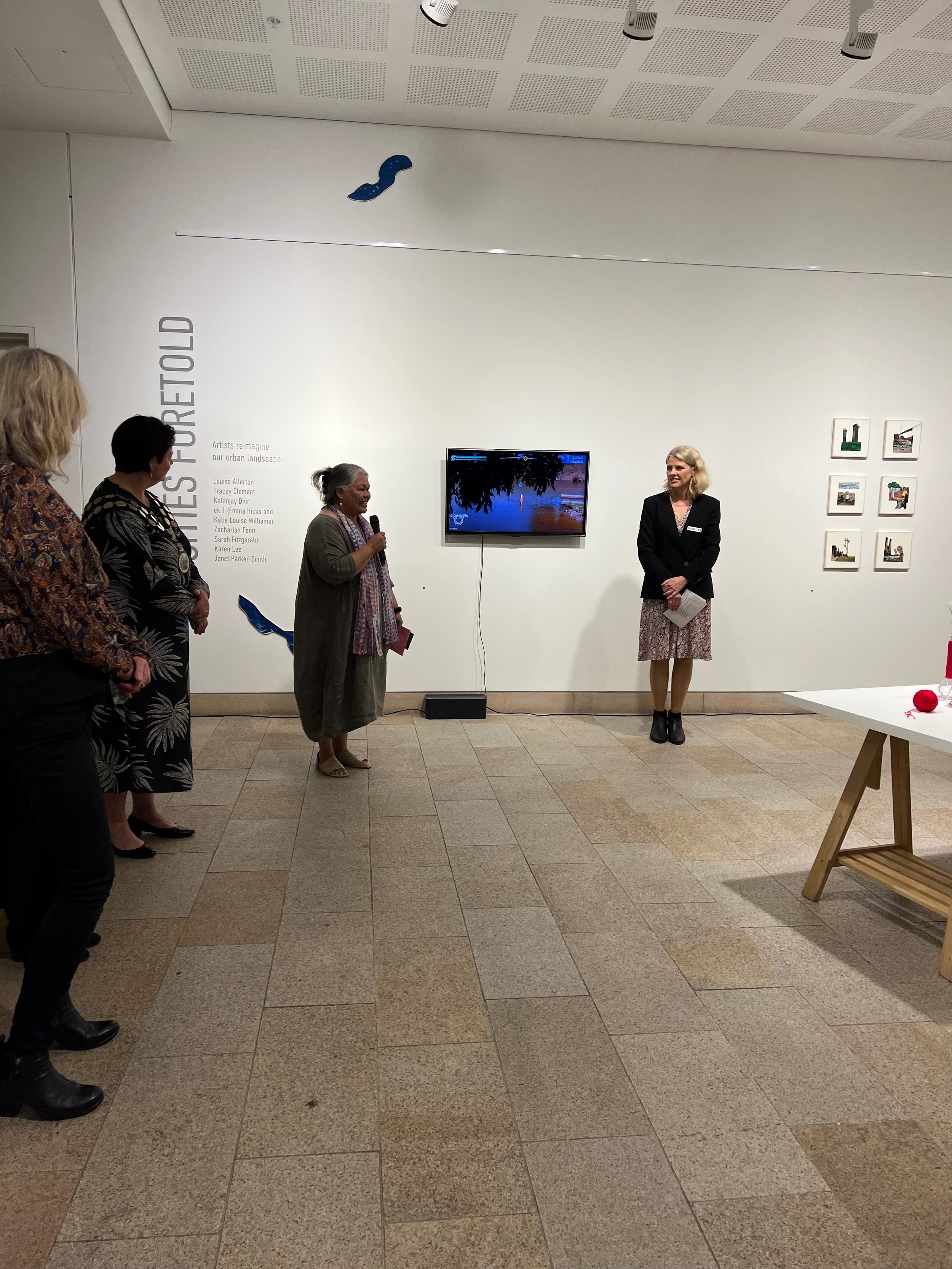
A recent exhibition/collaboration held at Barometer Gallery Paddington, NSW, March 2021.

“Artists Karen Lee & Michelle Chanique present their latest exhibition, Respond.  A collaboration between the two artists working with chance and the everyday where they use seemingly banal, utilitarian objects as a starting point for making thought-provoking and visually engaging works.”

——————

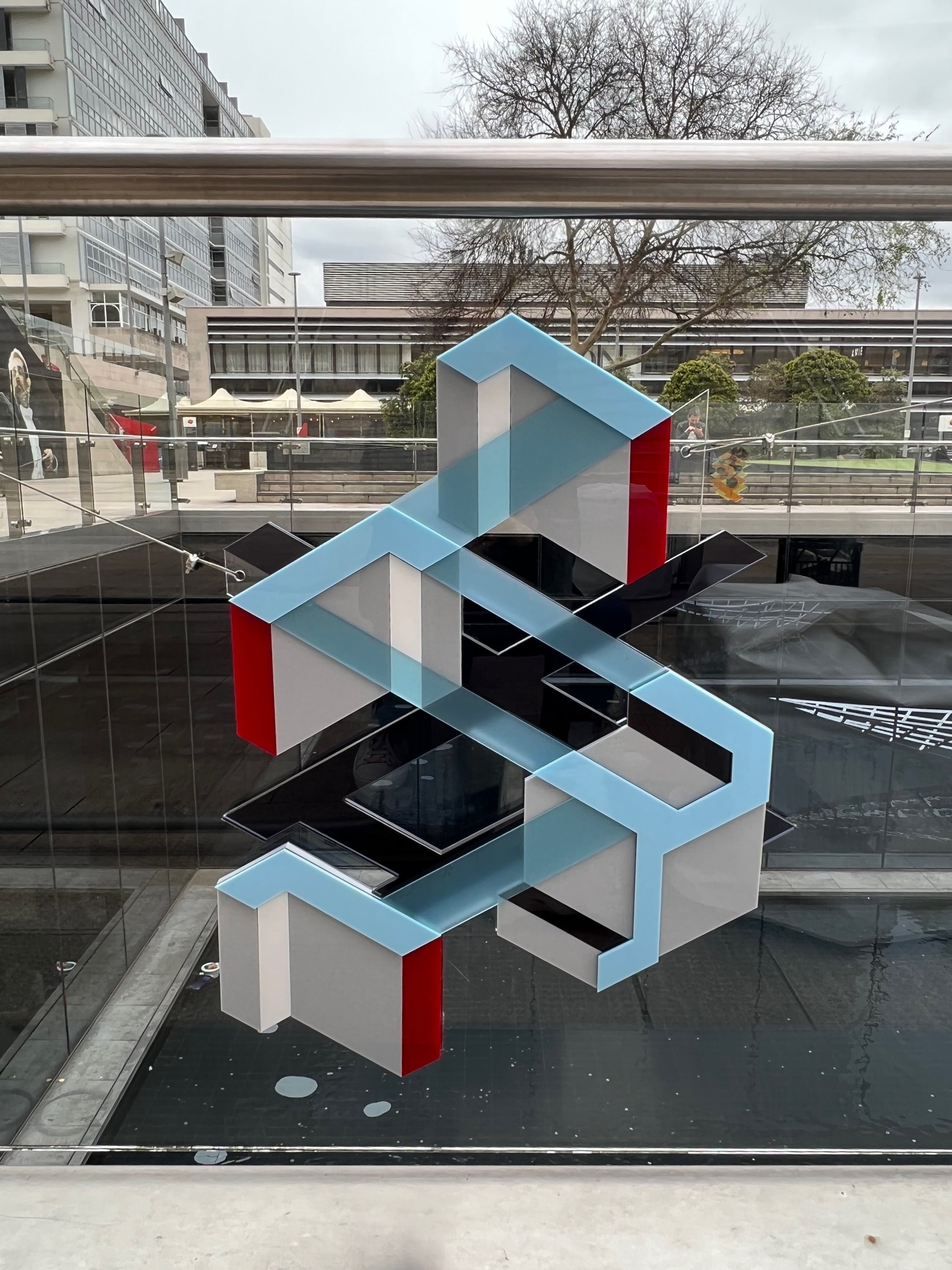
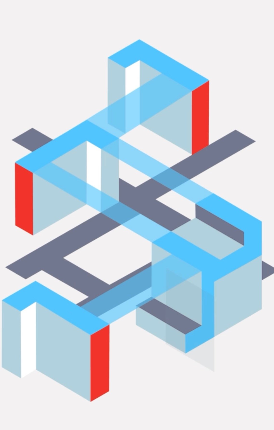
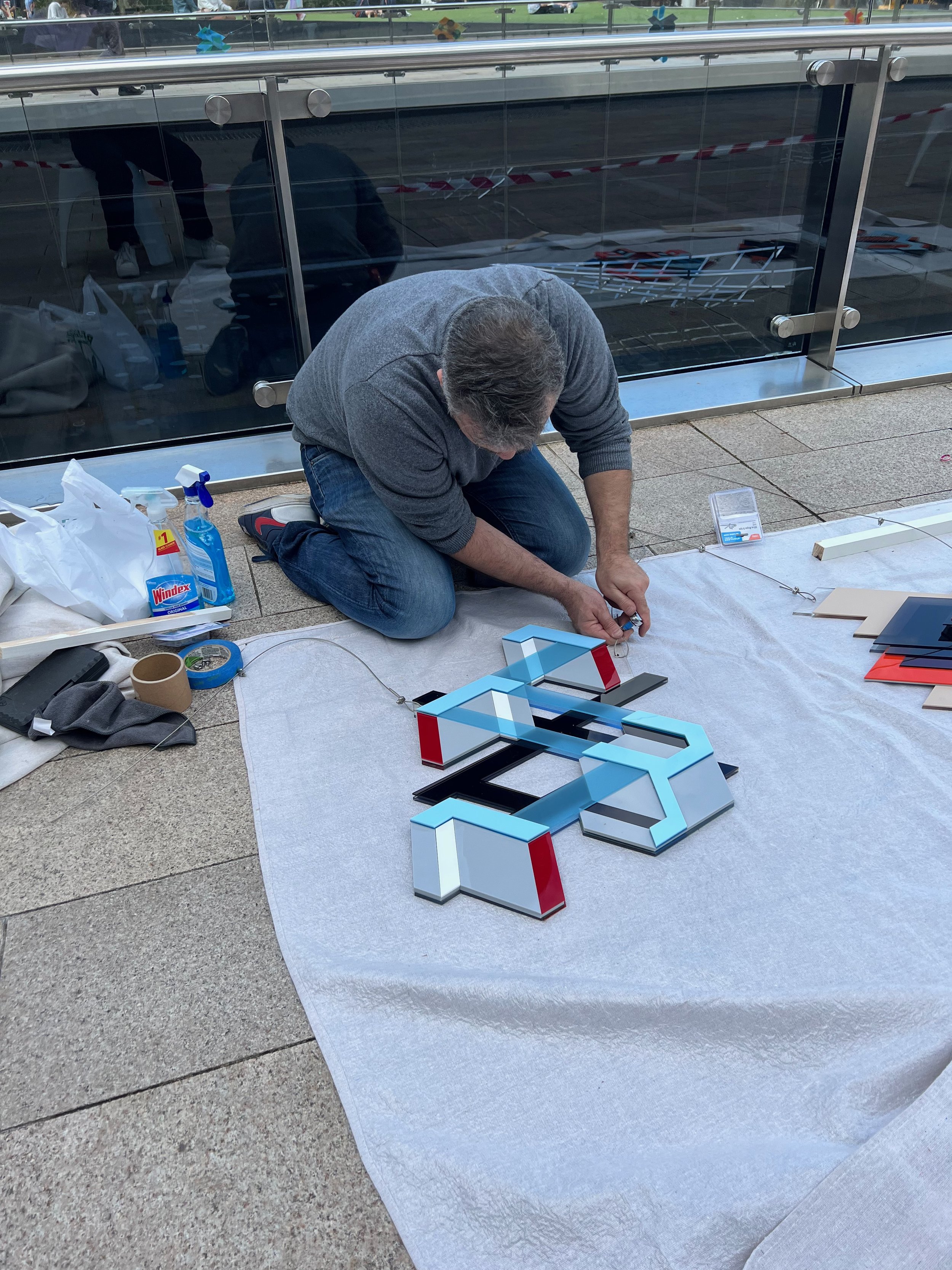
Michelle Chanique and Karen Lee explore the possibilities of collaboration through a shared interest in chance and the everyday. Collaboration and the use of chance both entail a loosening of control by the individual artist, while opening up the potential to discover unexpected outcomes.

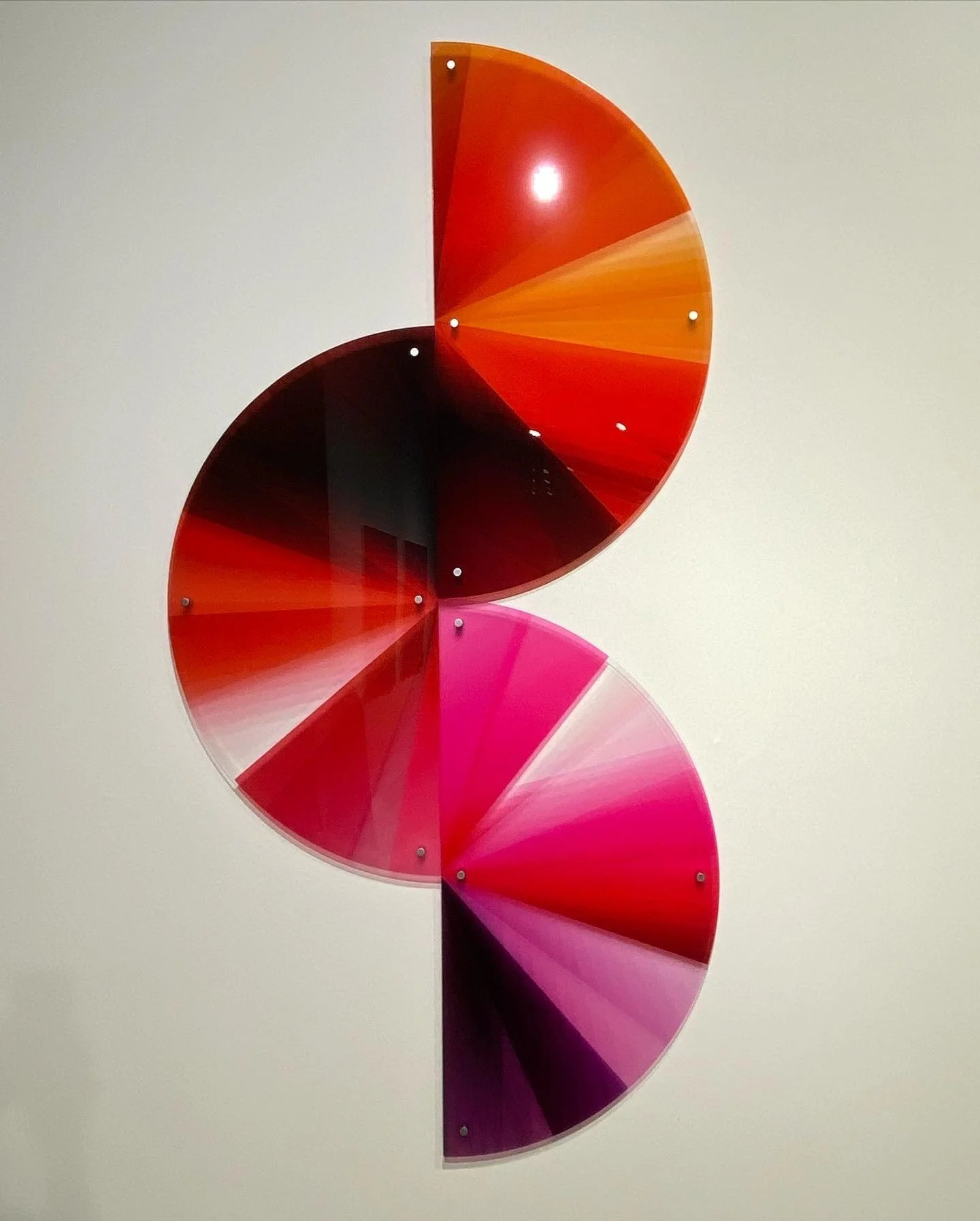
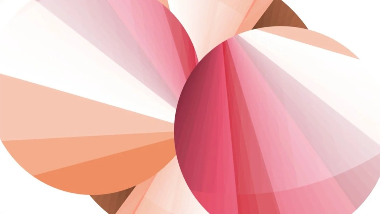
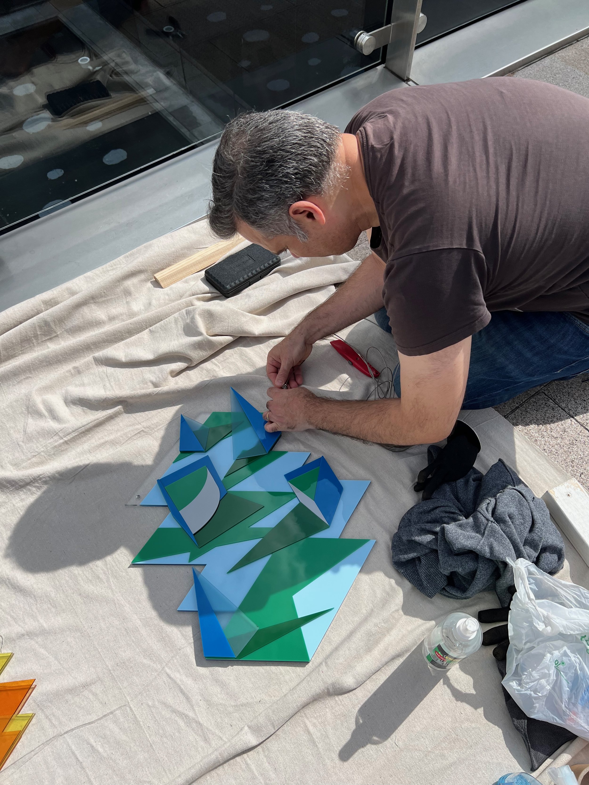
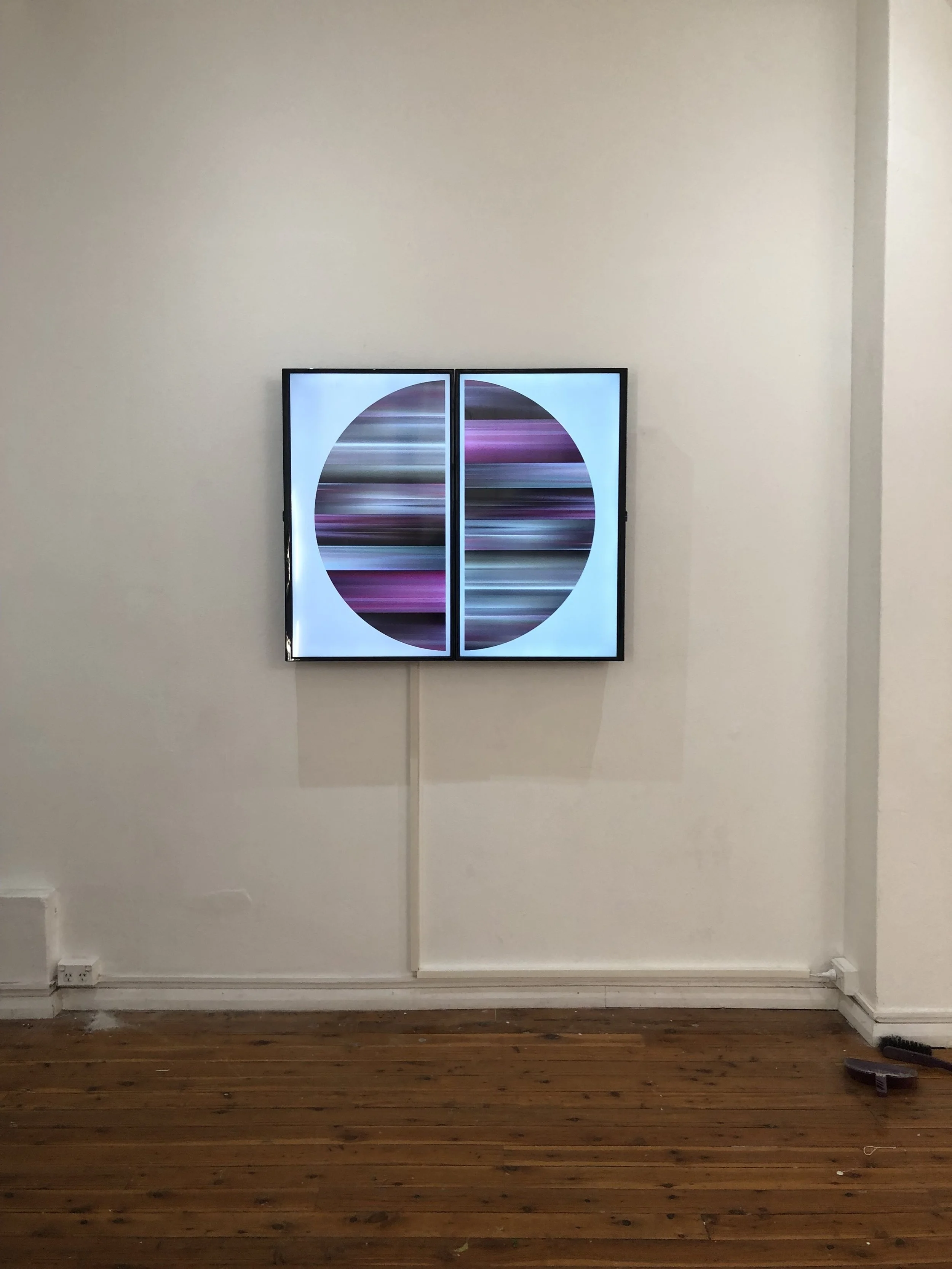
Starting with the seemingly mundane act of crumpling paper, Chanique hand makes a series of enlarged sculptures (Fold) that embrace the impossibility of producing an exact replica. Lee’s large abstract monoprints (Probability) employ randomness within their making to explore the subjective experience of colour. These works function as aesthetic objects but also, importantly, as evidence of their process. Chance multiplies chance. The means is the end.

With Cube both artists have created a soft object - like an oversized dice this floor work could be thrown by its owner to produce a random display. The use of chance in creating art appealed to artists such as John Cage, who used the I-Ching to create musical compositions as a technique to go beyond the boundary of his individual ego, while Marcel Duchamp utilised it to destabilise the deterministic, materialist model of the world that dominated Western thought.

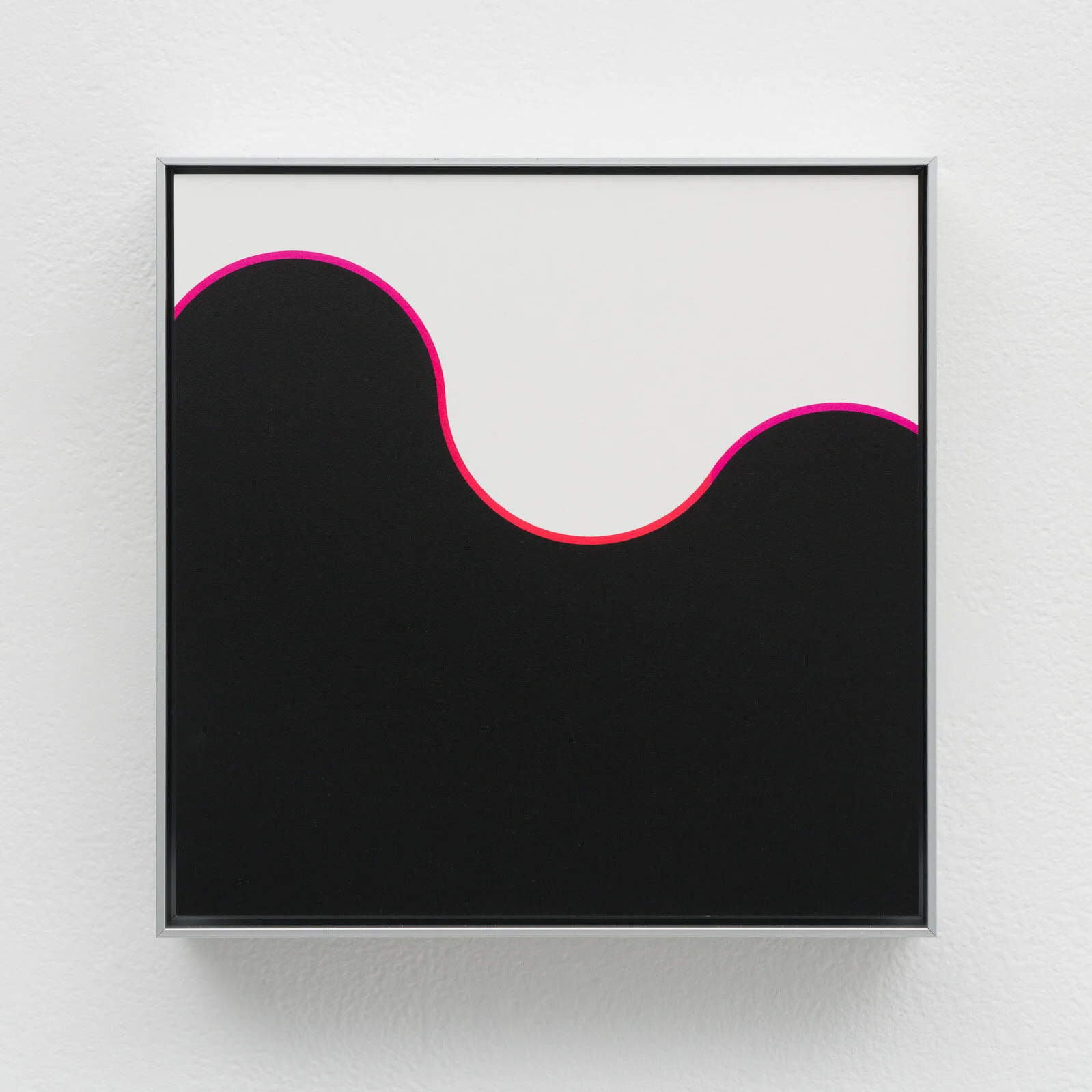
The use of seemingly banal, everyday objects as a starting point for making work is seen in the ten-panel series, the Respond Series. Victor Shklovsky said that art should take the familiar and present it in a way that made it seem unfamiliar, “making strange” as he called it, prompting the viewer to become more aware of their own perception of the world. This makes everyday life ideal material for art once we realise that the mundane world of things that we use and take for granted can also be a source of insight into the condition of our being and our experience of it. Here, the pairing of the finished works takes us from one mind to another, exploring such dualistic concepts as realism/abstraction, exterior/interior, and seeing/thinking about what is seen.

By Michael Waite

respond_einvite1.jpg
Chanique-Lee-WEB-20210316-.jpg
Chanique-Lee-WEB-20210316-5496.jpg
Michelle-Chanique-WEB-20210420-7132.jpg
Michelle-Chanique-WEB-20210420-7114.jpg
Michelle-Chanique-WEB-20210420-7127.jpg
Michelle-Chanique-WEB-20210420-7120.jpg
Michelle-Chanique-instagram-20201209-2220.jpg
Chanique-Lee-WEB-20210316--2.jpg
Chanique-Lee-WEB-20210316--3.jpg
Chanique-Lee-WEB-20210316-5499.jpg
Chanique-Lee-WEB-20210316-5503.jpg
Chanique-Lee-WEB-20210316-5506.jpg
Chanique-Lee-WEB-20210316-5508.jpg
Chanique-Lee-WEB-20210316-5514.jpg
Chanique-Lee-WEB-20210316-5516.jpg
Chanique-Lee-WEB-20210316-5519.jpg

Scala - Wellington St Gallery

Scala Sans, 2019

Watch on Vimeo

Multi-Channel video,
2 minutes, loop 

Currently showing at Wellington Street Projects, Chippendale, Sydney, from 7 -17 August 2019

(From my catalogue description):

In her new video work, Karen explores ‘Colour Resonance’, the subjective sensory and emotional experience of complimentary and dissonant colour ‘chords’ expressed using abstraction, geometry and installation techniques. This work extends the experience into 4D (time-based) using video. Lee explored the use of time and motion to express Colour Resonance using digital and tactile elements drawn from 2d forms, 3d sculpture, photography and video, aiming to discover synchronicities and interesting congruences of colour and form. Lee’s work intends to extend the experience of colour beyond light and hue, towards a new synaesthesia of resonance and dissonance. 

karen Lee_postcard 1 for kudos.jpg
Groundwork-WEB-20190816-9813.jpg
Groundwork-WEB-20190816--3.jpg
Groundwork-WEB-20190816--8.jpg
Groundwork-WEB-20190816-9756.jpg
Groundwork-WEB-20190816-9752.jpg
Groundwork-WEB-20190816-9757.jpg
IMG_2567.JPG
IMG_2569.JPG
IMG_2570_v2.jpg

Ripple - Gaffa Gallery

Paper Installation, Arches watercolour paper, acrylic paint

300 x 1.25 cm

June 2018, Gaffa Gallery, Sydney

Recently I used acrylic paint and watercolour paper to physically wrap a wall with stripes of paper. The effect of a single twist in each strip of paper causes an optical illusion. A series of two of these at different shows, allowed me to explore different palettes, one a mixed set of primary colours, the other, tones of blue.  I wanted to transform the two dimensionality of the coloured paper somehow and create something unexpected. I also wanted there to be a way for people to walk around it, for it to have a performative aspect to it. I worked with small maquettes to play with the colour but my rules were simple, work with colour from the tube and get maximum contrast and create a harmonious overall effect. The installing of the work was challenging for me as I had never worked at a 3-meter scale before and it took 4-5 hours each time to put up. 

This artwork is about the Experience of Colour – both subjective (emotional response) and objective (physics + biology). Starting with basic geometric shapes and colours that resonate with me, the work began by considering graphic representations of movement and light, progressed to modelling 3D forms and how the viewer’s motion in space can change how surfaces and shapes are perceived, and finally to enabling colour to be perceived from multiple perspectives at once. In this work, I set out to try and solve the problem of using flat colour on paper, and literally bending space itself to explore how colour could have a more physical, even illusory, impact on the viewer.

This was installed at Gaffa Gallery, Sydney, Jun 2018. A group show by UNSW Art & Design, Master of Arts students.

Check out the catalogue

1.jpg
2.jpg
3.jpg
4.jpg
6.jpg
7.jpg
IMG_5252.jpg
IMG_5255.jpg

Ripple Blue - Gaffa Gallery

Paper Installation, Arches watercolour paper, acrylic paint

300 x 1.35 cm

July 2018, Gaffa Gallery, Sydney

This is the second part of the Ripple Series. This installation was part of a group show, “Blue Gallery”, curated by Yi Zhang.

This artwork is about the Experience of Colour – both subjective (emotional response) and objective (physics + biology). Starting with basic geometric shapes and colours that resonate with me, the work began by considering graphic representations of movement and light, progressed to modelling 3D forms and how the viewer’s motion in space can change how surfaces and shapes are perceived, and finally to enabling colour to be perceived from multiple perspectives at once. In this work, I set out to try and solve the problem of using flat colour on paper, and literally bending space itself to explore how colour could have a more physical, even illusory, impact on the viewer.

1.jpg
2.jpg
3.jpg
4.jpg
IMG_6137.jpg

Peranakan Maquette - UNSW Art and Design

A project on cultural identity. My cultural background is Peranakan, a mix of Chinese and Malaysian, and living in Australia most of my life has lead to mixing these cultures and putting them all together like pieces of a puzzle. By using meaningful objects and images to convey this, and playing with negative space and silhouettes, the pieces are cut out and placed on a wall. Each piece is painted on watercolour paper with lines drawn with conté pencil. 

FullSizeRender (3)_1.jpg
IMG_2875_1.jpg
IMG_2872.JPG
IMG_2873_1.jpg
FullSizeRender.jpg

Prints

water 3 new size copy.jpg
water2b copy.jpg
antelope canyons bw cold A2.jpg
antelope canyons bw_warm_A2 2.jpg
antelope canyons1_A2 2.jpg
antelope canyons2aa_A2 2.jpg
prev / next
Back to Karen Lee Artworks
video still_6-Karen_lee_one.jpg
0
One, Double Vision
cover for squarespace.jpg
0
One - Passage of Night; Luminary Rising
PHOTO-2022-06-16-10-55-25_brighter.jpg
16
Unfold - Parallel Wanderings
leaves blue2 small.jpg
4
Leaves - No Vacancy Gallery
new_flower.png
11
Peranakan - Inner Edge Drifting
flower3a.jpg
10
Epiphyllum
future flowers button copy.jpg
6
Future Flowers
button3.jpg
3
Colour Chords
button1a qualia.jpg
7
Qualia - UNSW Art and Design
3107F4CF-9FFD-44B2-8B9D-1BEF4BE790DF.jpg
22
Dialogues - Cities Foretold
Michelle-Chanique-instagram-20201209-2220.jpg
17
Respond - Barometer Gallery
button1a scala.jpg
10
Scala - Wellington St Gallery
1.jpg
8
Ripple - Gaffa Gallery
5
Ripple Blue - Gaffa Gallery
5
Peranakan Maquette - UNSW Art and Design
6
Prints